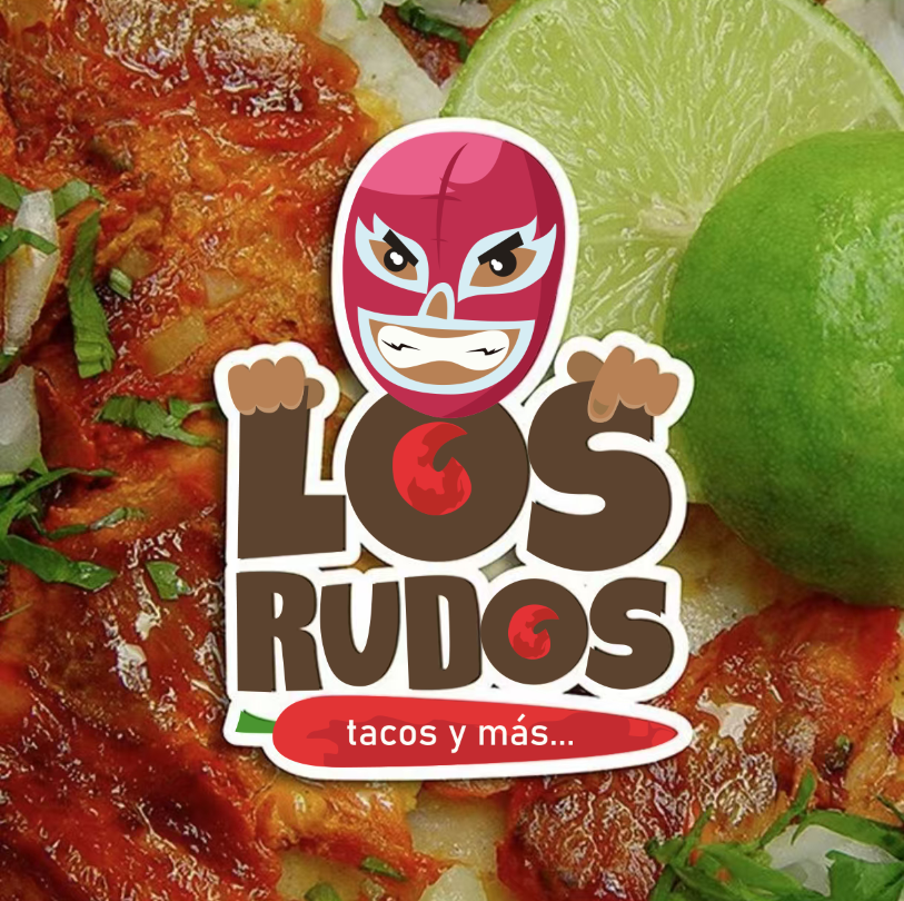
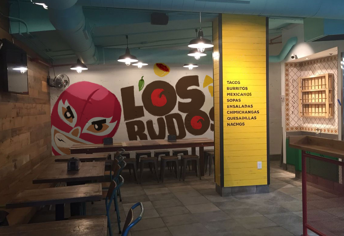
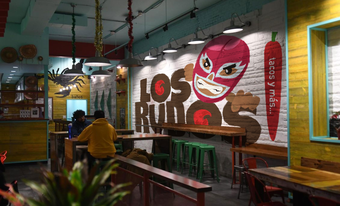
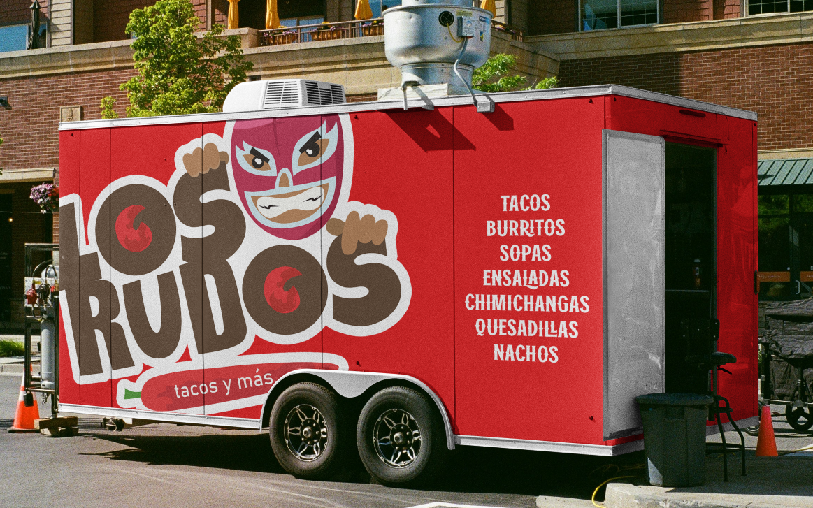
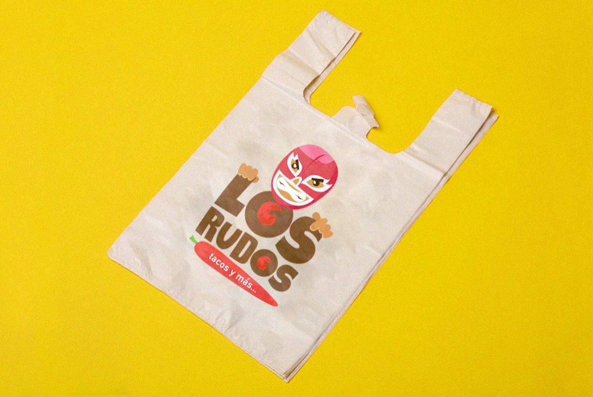
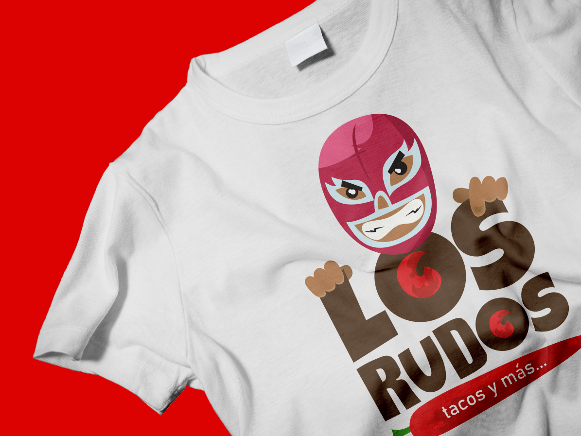
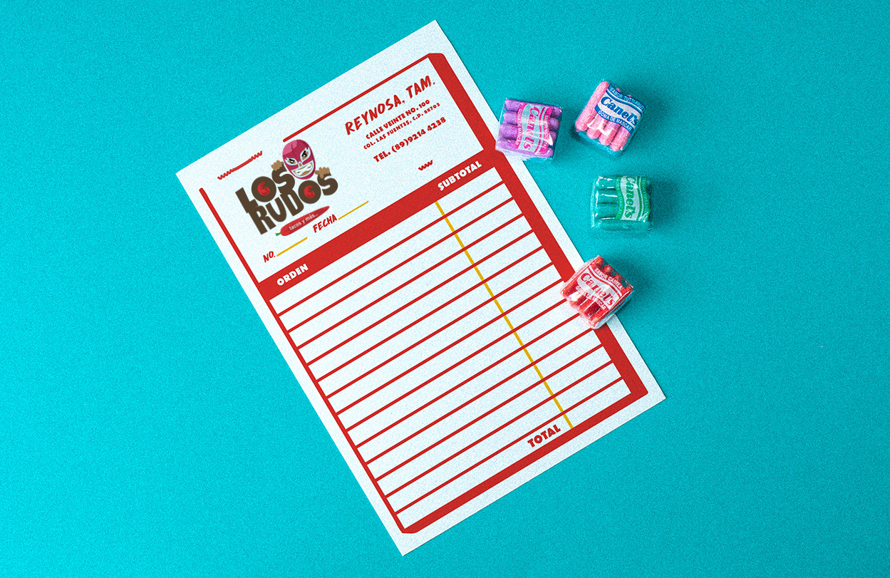
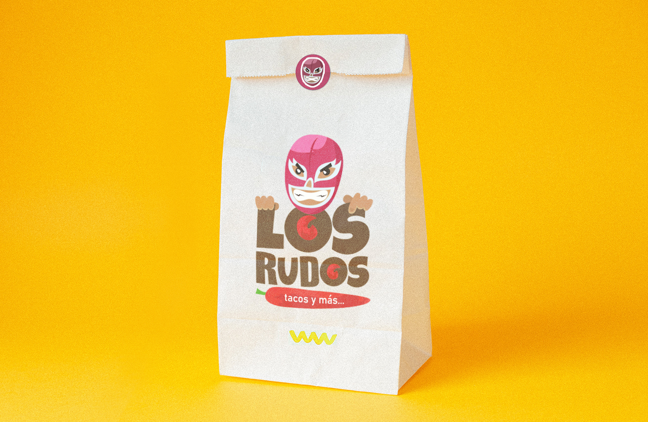
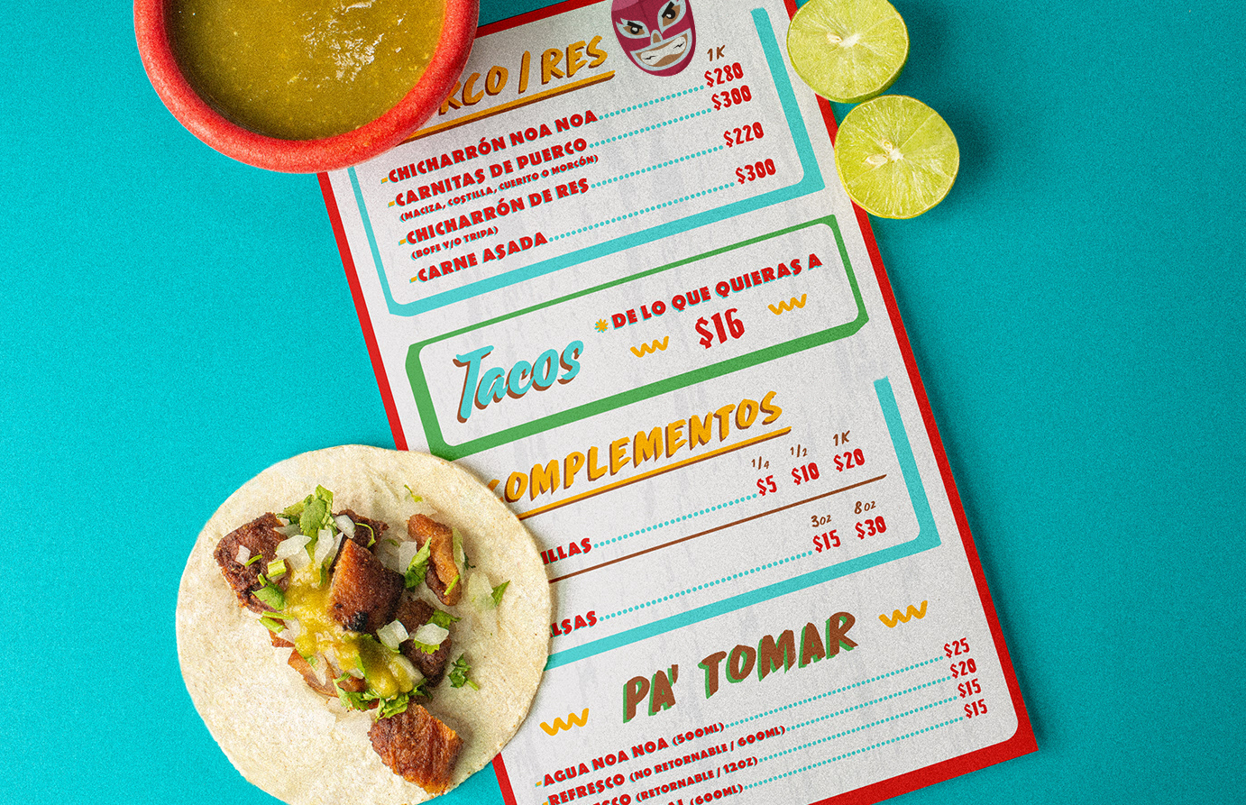
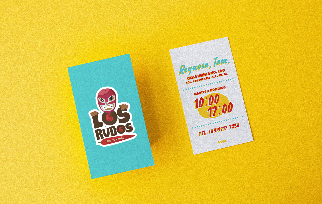
Illustration & Branding
Los Rudos
Mexico, 2017
Created in Mexico during 2017. The design features a bold and rugged aesthetic, which aligns with the word "RUDOS" that in spanish means "Tough", a connection to mexican wrestling, a very important icon in mexican identity.
The logotype's style resonates with a local audience, emphasizing authenticity and a connection to Mexican culture and authentic mexican flavors, while appealing to a broader audience through its modern design elements.